Hi Beverley,
There are ways to set up colour-coded ROB diagrams in EPPI Reviewer, as described below. (Further details, including the initial creation of the ROB codeset and report, can be found from page 79 of the manual, available at https://eppi.ioe.ac.uk/cms/Default.aspx?tabid=2933.)
Hope that helps, but do let us know if you need any further assistance or information.
Kind regards,
Zak Ghouze
"Once you have created your coding tool and coded your studies you can create the risk of bias diagram in the Reports tab.
The report should be a Question report. You should start by creating a new column for each question that you wish to display and then drag in the appropriate question into each column from your coding tool. For the report to appear as you expect you will want to only have one question in each column.
Be sure to Save your report once you finished putting it together.
Once the report is set up you should click Run. This will bring up the Reports window.
From this window you should select the report name and the items to include in the report. You should also check the Show as Risk of Bias figure checkbox. Once you have done this click Go.
Two diagrams will be generated and displayed in the Report viewer window.
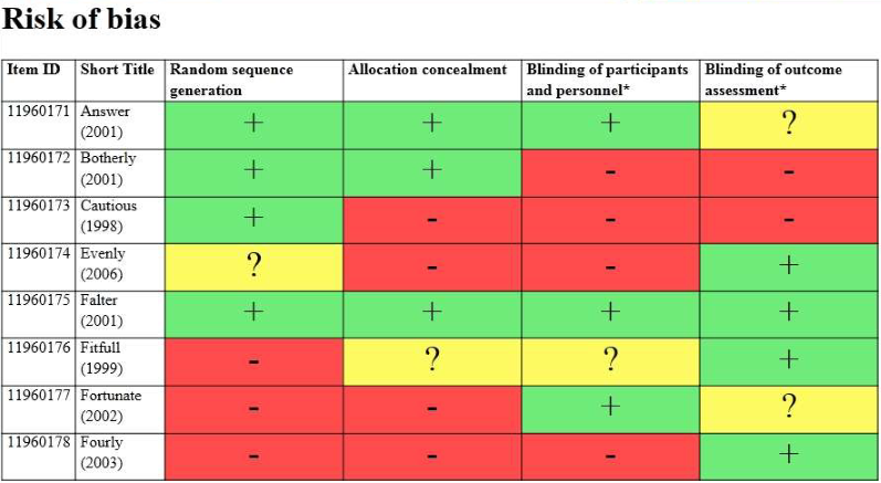
The first diagram will display each study in its own row and the rating that you have given it for each question. The low risk ratings are shown as green with a plus sign, the high risk ratings are red with a minus sign and the unclear items are displayed in yellow with a questions mark.
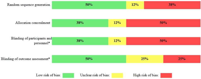
The second diagram will display the percentage of items that were assigned a particular rating with respect to each question. The colour coding is as before (green : low, red : high, yellow : unclear) but with the percentage written in the bar.
As with all other reports that are displayed in the Report viewer you can save it as a Word document, or an html file or a text file. If you wish to have it in Excel you just need to save it as an html file and then open that file in Excel.
Analysis of your data 81
The first diagram will display each study in its own row and the rating that you have given it for each question. The low risk ratings are shown as green with a plus sign, the high risk ratings are red with a minus sign and the unclear items are displayed in yellow with a questions mark.
The second diagram will display the percentage of items that were assigned a particular rating with respect to each question. The colour coding is as before (green : low, red : high, yellow : unclear) but with the percentage written in the bar.
As with all other reports that are displayed in the Report viewer you can save it as a Word document, or an html file or a text file. If you wish to have it in Excel you just need to save it as an html file and then open that file in Excel."